Have you noticed that whenever AI generates images, it ALWAYS fails — at text?
Not sure if you feel the same:
AI-generated images are fast and beautiful, but the moment text appears, everything collapses.
- Letters melt, warp, or distort
- Layout becomes unstable
- Spacing looks off
- Big headers are okay, but small text is unreadable
- After finishing an IG post, you STILL have to go back to Figma to fix the text
So even though AI speeds up the first 80%,
the last 20% — the typography — is still manual hell.
But with FLUX.2, this finally changes.
The biggest breakthrough from Black Forest Labs this time isn’t skin texture, lighting, or the VAE —
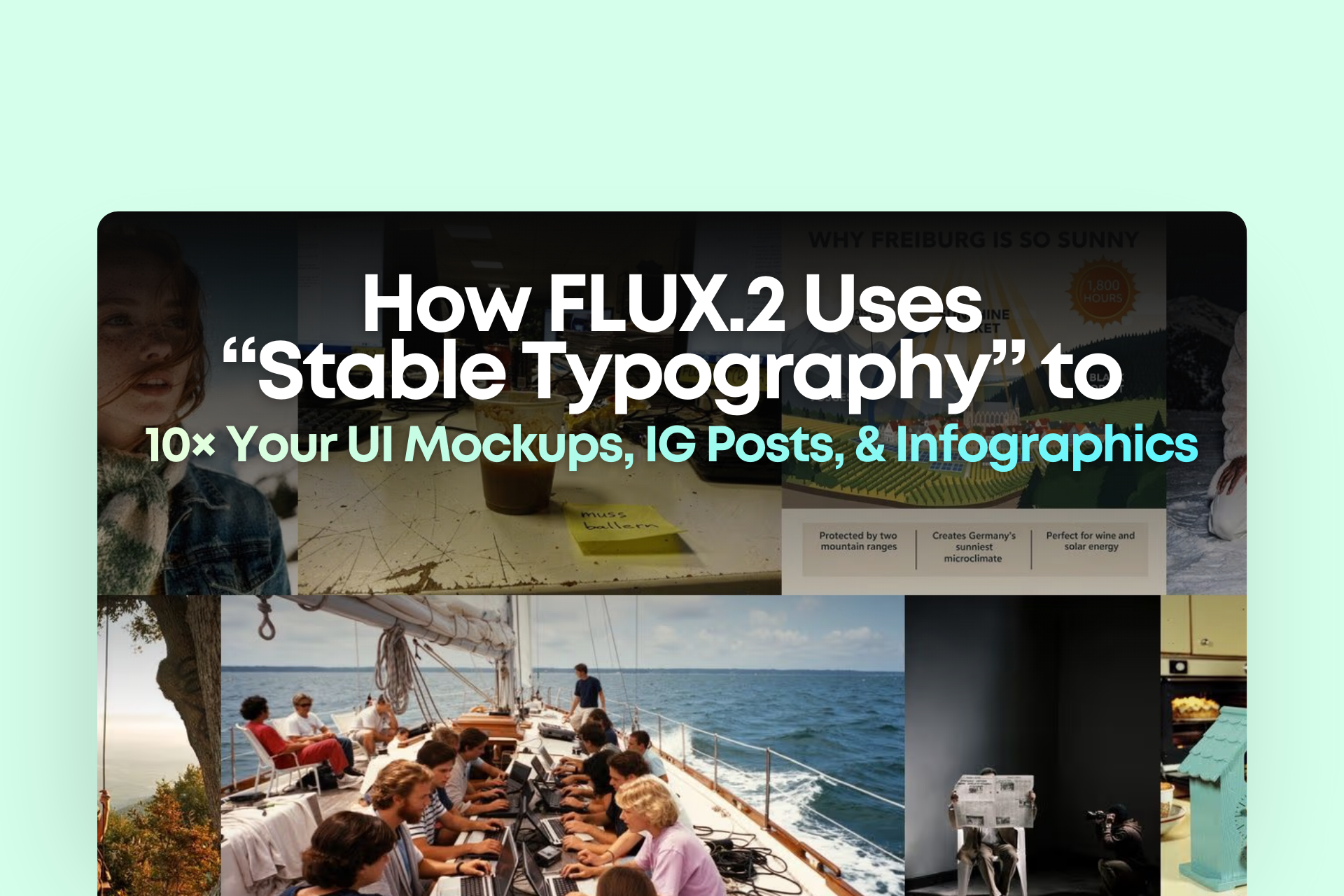
it’s typography that’s clean, stable, and truly production-ready.
And if you work in UI/UX, IG content, pitch decks, infographics, or ad creatives, this article will help you:
- Understand why FLUX.2 text is so stable
- Use 10 reference images to create a consistent brand series
- Apply 4MP editing for final refinement
Ready? Let’s dive in.
Why can FLUX.2 finally produce “no-post-editing-needed” typography?
1. A brand-new text rendering pipeline — it no longer “draws text blindly”
The problem with previous AIs (Midjourney, FLUX.1, etc.) wasn’t that the models were weak —
it’s that they were drawing text like images, not understanding the structure of letters.
FLUX.2 retrained its font modulation, allowing the model to:
- Understand English letter structure
- Handle kerning (spacing between letters)
- Understand baseline alignment
- Maintain consistent bounding boxes without distortion
The result?
Text inside UI mockups, IG layouts, and data cards looks like a real designer made it.
2. Stronger structural understanding: it actually knows where the title and caption go
Previously, prompts like “make a clean UI” produced chaotic layouts.
But FLUX.2’s spatial awareness is clearly upgraded.
It can now:
- Automatically place the title at the top
- Use smaller text for captions at the bottom
- Manage padding and margins correctly
- Align icons and text naturally
For anyone making decks, UI, or content — this is huge.
3. Much stronger text-to-layout prompt obedience
Example prompt:
Minimal app UI. Title: "Daily Focus". Subtitle: "Your tasks, simplified." Three cards: "Work", "Personal", "Ideas". Clean grid layout.
FLUX.2 can follow 80–90% of this.
Older models gave you something UI-ish, but not actually usable.
This difference is the difference between:
“usable” vs “not usable.”
How to Use 10 Reference Images to Keep Brand KV / UI Style Consistent
This is one of FLUX.2’s strongest features.
You can include references for:
- Brand color palette
- Typography direction (e.g., minimal sans-serif)
- IG layout style
- UI aesthetic (clean / energetic / fintech / startup)
- Previous Instagram posts
- Previous deck screenshots
The result?
One “brand template” can generate a full month of content.
4MP Editing: Final Touches (lighting, spacing, icon fixes)
Even though FLUX.2 text is much better, sometimes you still want fine adjustments.
4MP editing lets you:
- Change one word
- Adjust color
- Fix edges
- Replace icons
- Slightly shift layout
Your workflow goes from a 5-step process to a simple 2-step one:
AI Generate → Fine Edit → Done
Conclusion: AI Imaging Has Officially Moved From “Creative Tool” → “Work Tool”
FLUX.2 now truly delivers:
- Clean typography
- Credible UI
- Readable infographics
- KV graphics ready for use
- Almost zero post-editing required
At this moment, AI image generation is no longer a toy —
it can genuinely replace parts of the design workflow.
For business owners, marketers, and creators like you, this means:
— You can produce the output of an entire content team by yourself.
— You can 10× the speed of your campaigns.
— You can maintain a consistent visual style for a whole month of content.